
- June 22, 2026
- Grady Tanne
- 0
Color shapes more than just your daily outfits or your Instagram feed; it has a profound influence on your home vibe, your sense of comfort, and even your mental space.
Deliberately chosen palettes can nurture relaxation, fuel creativity, or spark energy. But how do you use color psychology to create a space that looks beautiful and feels right?
This post explores how colors affect mood and perception, ways to select the perfect tones for every room, and practical tips for blending personal style with psychological science.
You’ll discover how subtle shifts in hue can bring new energy into your home and leave you feeling more at ease, inspired, or centered.
Creating Calm With Blue and Green
The Tranquil Effects of Blue
Soft, cool blues bring to mind cloudless skies and serene lakes. Research in color psychology consistently links blue with feelings of calm, trust, and security.
Spaces painted in muted or pastel blue shades have been shown to lower heart rates and reduce stress. Blue bedrooms, in particular, are associated with deeper, more restful sleep.
The Refreshing Power of Green
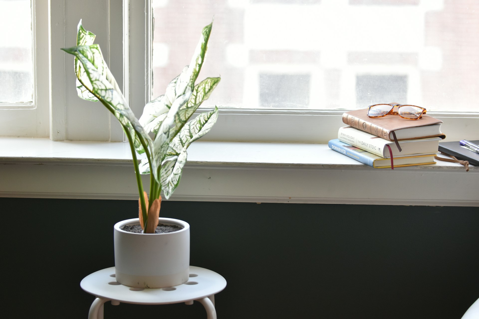
Green, equally calming, takes its cues from nature. Homeowners often use green in living rooms or offices to establish a sense of renewal and balance. According to multiple studies, green can also boost concentration and alleviate visual fatigue, making it a smart choice for spaces where you work or read.
Quick tip: If your home feels hectic, integrating blue and green accents through soft furnishings or wall art can cultivate a subtle, restorative effect on your mental space.
Energizing With Yellow and Orange
Harness Warmth and Optimism
While bright reds are sometimes overwhelming, yellow and orange offer a gentler way to infuse energy into your home vibe.
Yellow is often described as the color of optimism, instantly making spaces appear sunnier and more inviting. Kitchens and dining areas with yellow accents can feel more welcoming and encourage lively conversation.
Find the Balance With Orange
Orange brings together the zing of red and the cheerfulness of yellow. Used in moderation, such as through decorative accessories or accent walls, it can stimulate creativity and boost enthusiasm.
However, too much orange or yellow may cause restlessness, so balance these tones with neutrals or natural wood for a harmonious effect.
Example: A breakfast nook with a yellow banquette or orange pendant light can transform morning routines into moments of joy.
Creating Sophistication With Neutrals
Earth Tones and Minimalism
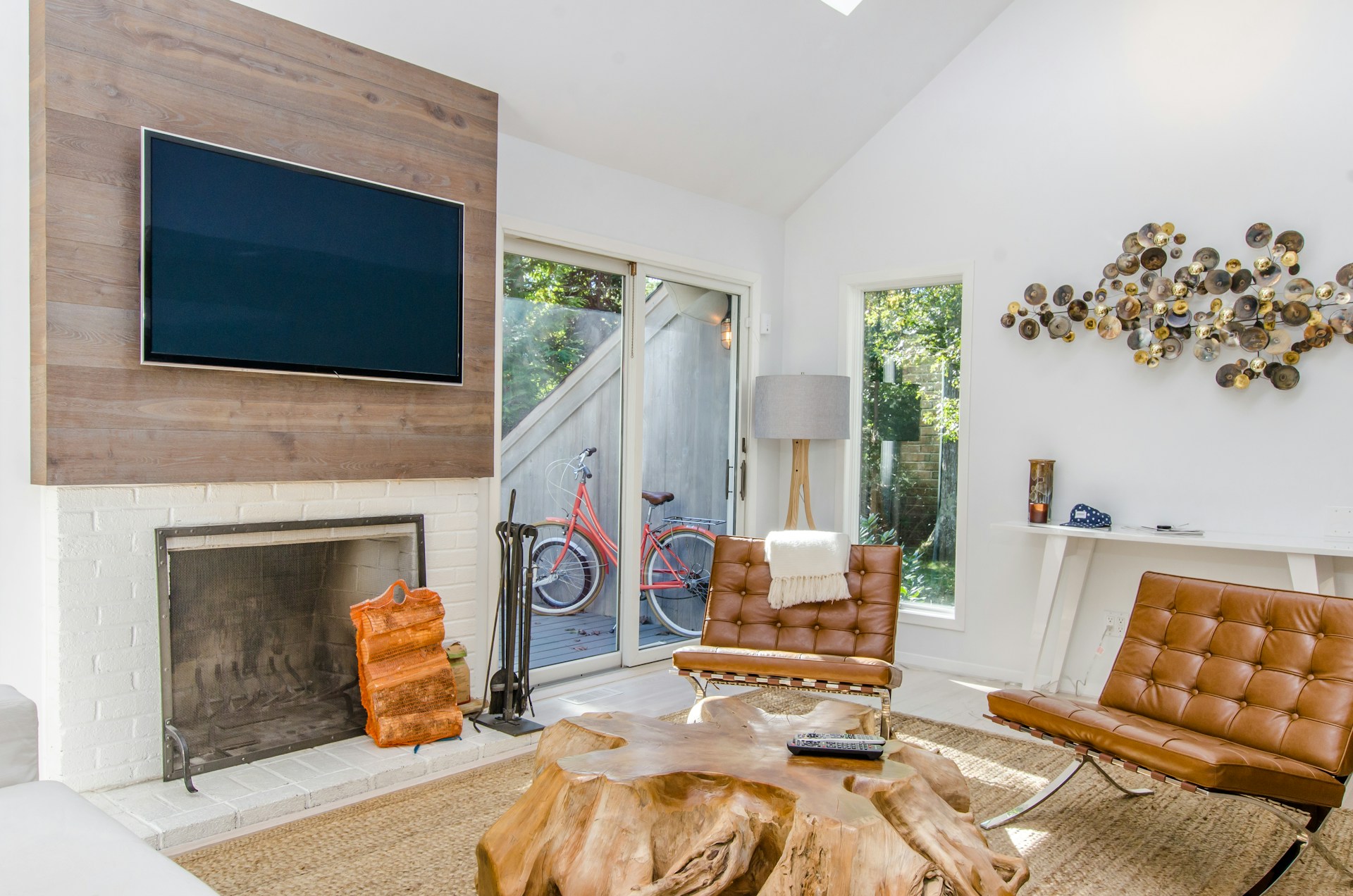
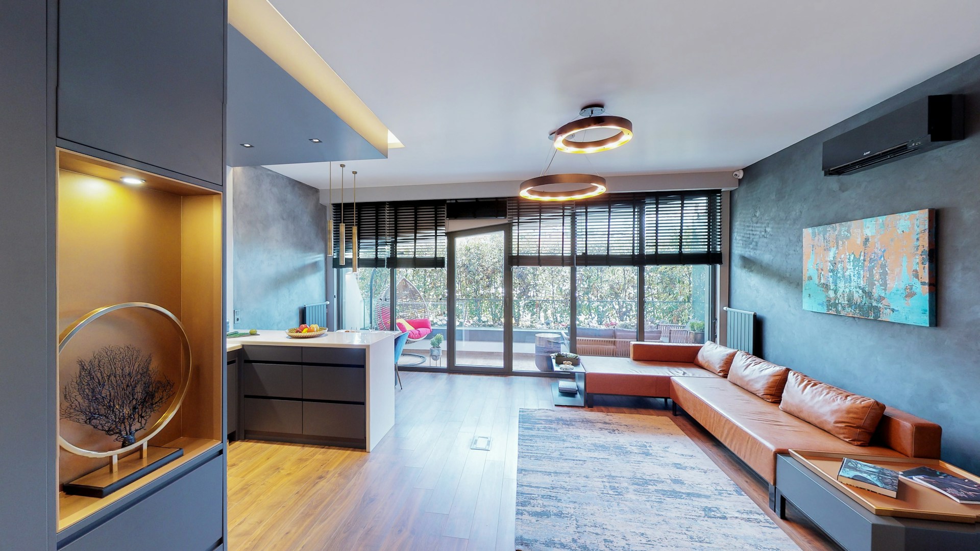
Beige, taupe, and gray are more than safe fallback options. Neutrals, especially earth tones, give your living space a sophisticated foundation, making it easy to switch up accessories or experiment with trends. They’re favored by interior designers because of their timeless appeal and versatility.
Layering Texture for Interest
When you use mostly neutral colors, texture becomes crucial. Think nubby wool throws, linen curtains, or matte ceramics. These elements add depth, warmth, and a sense of coziness that prevents neutral spaces from feeling clinical.
Pro tip: Mix at least three textures in a neutral room to keep things visually engaging and comforting.
If you’re planning a move and want your new space to reflect these same thoughtful color choices from day one, staying organized during the transition matters just as much as picking the right palette.
Moving companies that rely on modern moving and storage company software can track every shipment and box through the process, so your furniture, decor, and color-coordinated pieces arrive exactly where and when you need them to bring your new home vibe to life.
Mood-Boosting With Red and Pink
Red as a Statement
Red commands attention and symbolizes passion and energy. While covering all four walls in red can be overstimulating, using it for an accent wall, artwork, or furniture adds visual drama and sparks excitement.
Red is particularly powerful in social spaces like dining rooms or entryways where you want a lively, engaging atmosphere.
Pink for Softness and Comfort
Pink, especially in dusty, blush, or rose hues, soothes and comforts. It has evolved from a girlish cliché into a sophisticated favorite for bedrooms, reading corners, or quiet nooks. Pink brings warmth and a nurturing quality without the intensity of red.
Quick suggestion: Combine pink cushions or throws with neutral or gray sofas for a contemporary, calming effect.
Enhancing Focus and Clarity With White and Light Shades
The Power of White
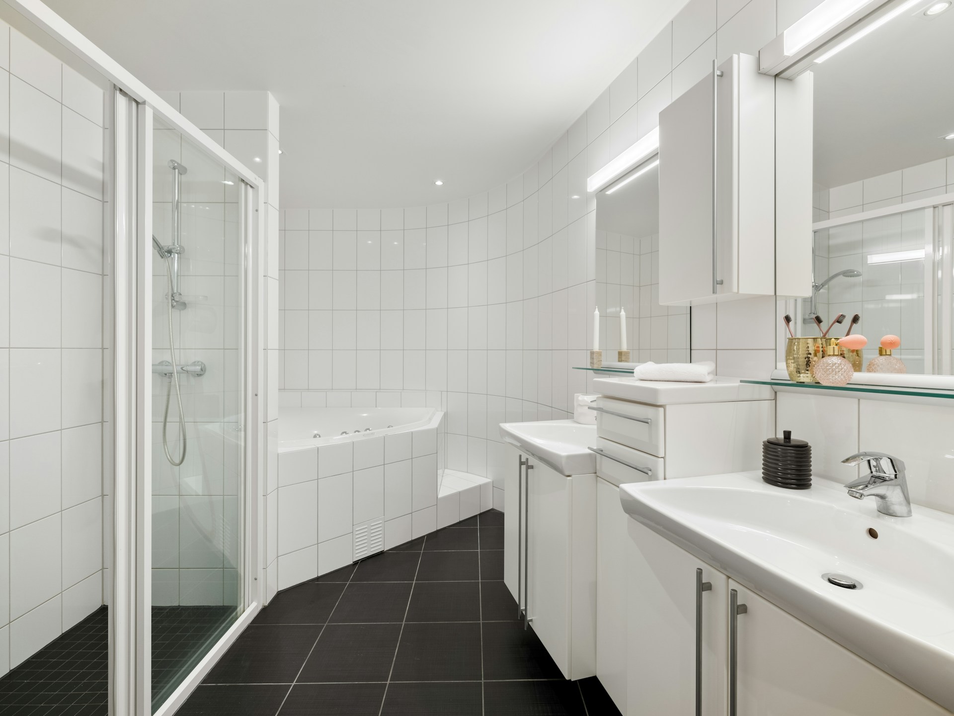
Crisp whites and very pale tones make rooms appear more spacious and airy. These colors reflect natural light, giving even small spaces a sense of openness. For home offices or creative studios, white is ideal because it reduces distractions and enhances clarity of thought.
Choosing the Right Undertone
Not all whites are created equal. Warm whites (with yellow or peach undertones) read cozy, while cool whites feel cleaner and more modern. Consider the direction of your natural light and the mood you want to create before selecting a shade.
Example: Soft white walls in a study, paired with a pale blue accent chair, deliver both clarity and calm.
Bringing Personality Through Accent Colors
Statement Pieces and Pops of Color
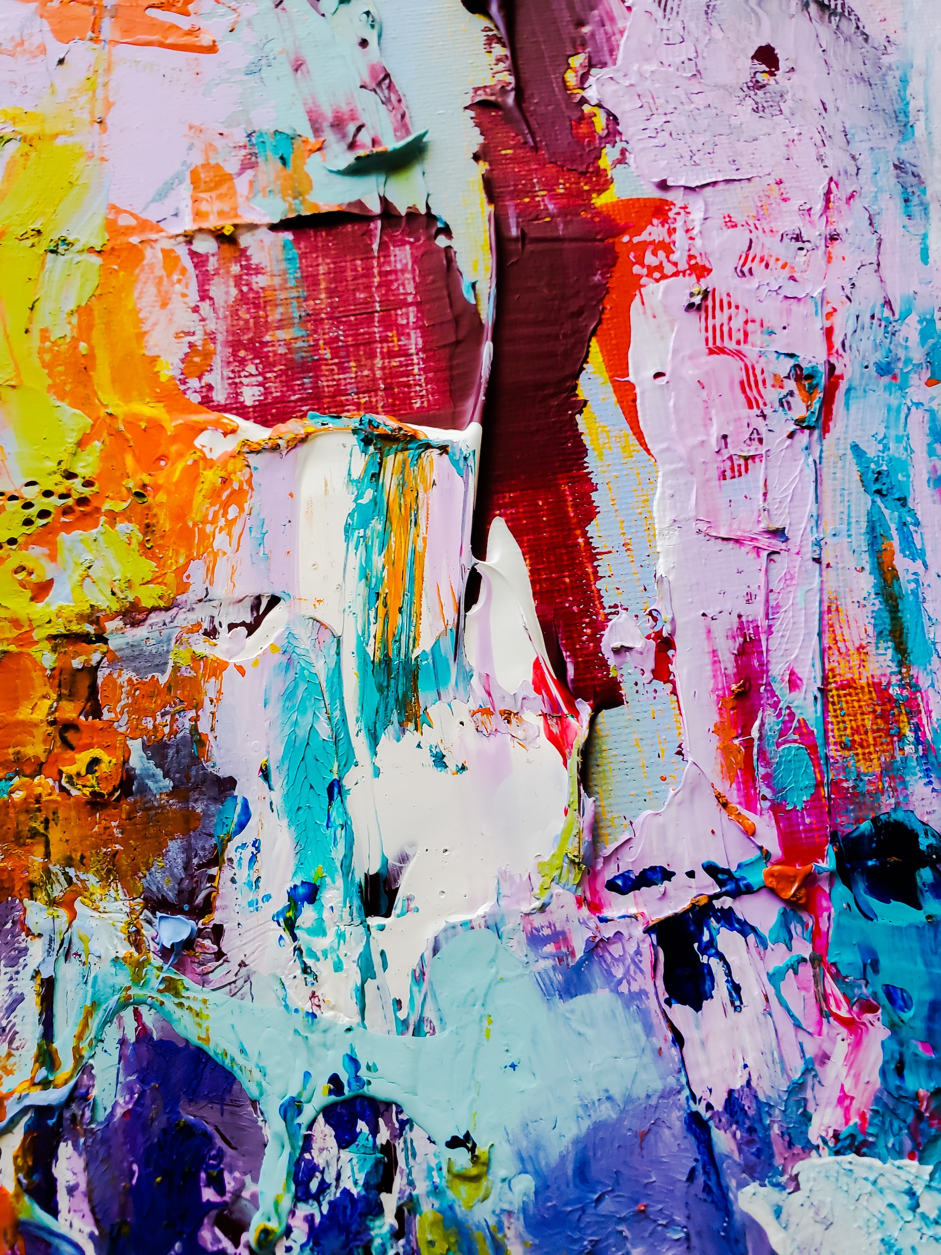
Sometimes a single emerald-green vase, violet rug, or gallery of colorful artwork provides all the personality a space needs. Strategic pops of color allow you to experiment and evolve your home vibe without overwhelming your mental space.
The Benefits of Experimentation
Trend reports suggest mixing bold accent colors with grounding neutrals to ensure longevity and flexibility. This approach makes it easy to swap out trendy patterns or bold objects when tastes shift.
Tip: Start small, such as colorful cushions or lampshades, and pay attention to how these choices affect your mood.
Making Color Psychology Work For You
Personalizing Your Palette
While color psychology offers general guidelines, every person experiences color differently based on associations, memories, and culture. The best home vibe emerges when your palette reflects not just scientific theory, but your style and comfort.
How to decide:
- Walk through your rooms at different times of the day to see how light and color interact.
- Collect inspiration from design magazines and apps, then note which colors consistently attract you.
- Paint sample swatches or use temporary decor items to test the feel before committing to a full redesign.
Design Your Best Living Space
Color is a powerful design tool for shaping not just how your home looks, but how it makes you and your guests feel. Understanding the basics of color psychology can help you transform any room—from tranquil blue bedrooms to energetic yellow kitchens, or cozy pink corners.
If you want to refresh your mental space and your home vibe, start by noticing how each room currently feels. Try introducing a new color accent or swapping out a tired palette for something that better reflects your mood and vision.
Allow your space to evolve with you, and remember that the right combination of shades can elevate your well-being as much as your aesthetic.